Designing Zapo web platform: simplifying CRM for Local businesses
Designing Zapo web platform: simplifying CRM for Local businesses
Project overview
Project overview
Project overview
Website: zapo.com
Website: zapo.com
Team: Zapo team (PM and Developer)
Team: Zapo team (PM and Developer)
Created at: heartbeat.ua
Created at: heartbeat.ua
What I worked on:
What I worked on:
What I worked on:
Brand Identity refresh (took a part)
Brand Identity refresh (took a part)
Landing page redesign
Landing page redesign
Product design
Product design
Icon pack design
Icon pack design
So, what is Zapo?
So, what is Zapo?
So, what is Zapo?
Zapo is a lead generation company that helps local businesses connect with new clients. They run targeted ads, offer a CRM to track leads (we will talk about this), and even help businesses build simple websites.
Zapo is a lead generation company that helps local businesses connect with new clients. They run targeted ads, offer a CRM to track leads (we will talk about this), and even help businesses build simple websites.

Imagine this:
You’re a small business owner. You’ve got new leads, but no idea where to track them. You’re juggling appointments in your notebook. You can’t remember who you called or when. You try logging into your CRM… and spend 10 minutes trying to figure out where to update a lead’s status. Or worse - you give up and go back to the notebook.
That’s what we were dealing with.
That’s what we were dealing with.
Zapo's old Timeline view

The Challenge:
Zapo reached out with a clear goal: improve the UX (main connection between Contacts page and Contact's Timeline) and make it easier to understand. Users found the platform hard to use and overwhelming at times. On top of that, the team felt the branding needed a refresh to better reflect the product’s mission and personality.
So, we started digging in. Together with the Zapo team, we:
So, we started digging in. Together with the Zapo team, we:
Mapped the user journey from getting a new lead to closing a deal
Mapped the user journey from getting a new lead to closing a deal
Created user flows for the key pages: Contacts and Timeline flow
Created user flows for the key pages: Contacts and Timeline flow
Reviewed user feedback to pinpoint what wasn’t working
Reviewed user feedback to pinpoint what wasn’t working
We also explored and made a competitors research like HubSpot, Zoho CRM, and Pipedrive. Some felt overwhelming, especially for small business users, but there were also good design choices we learned from and adapted to Zapo’s needs.
We also explored and made a competitors research like HubSpot, Zoho CRM, and Pipedrive. Some felt overwhelming, especially for small business users, but there were also good design choices we learned from and adapted to Zapo’s needs.
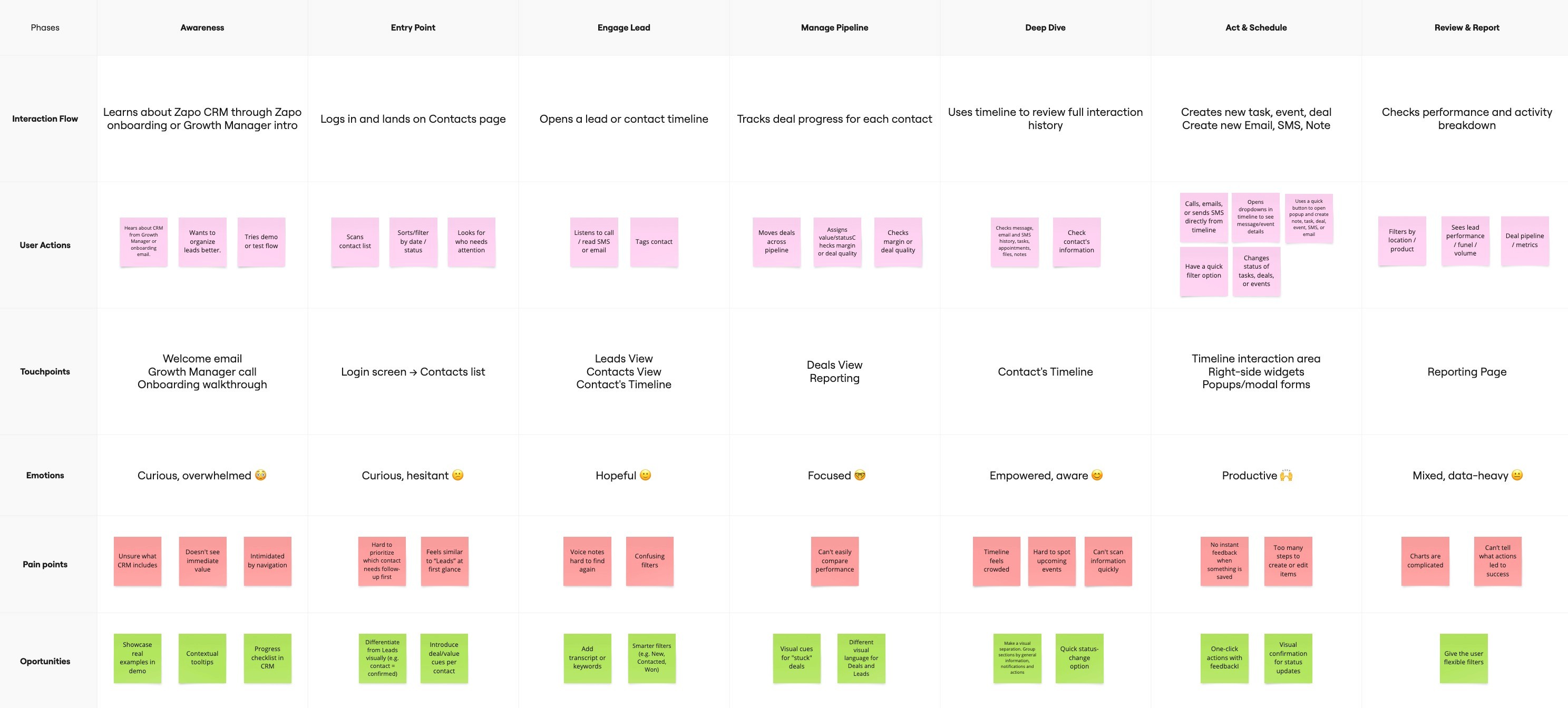
Mapped the user journey from learning about Zapo to interactions with timeline

User flow for the key user path from Contact page to Timeline and what actions are possible there

Pinpointing what wasn’t working
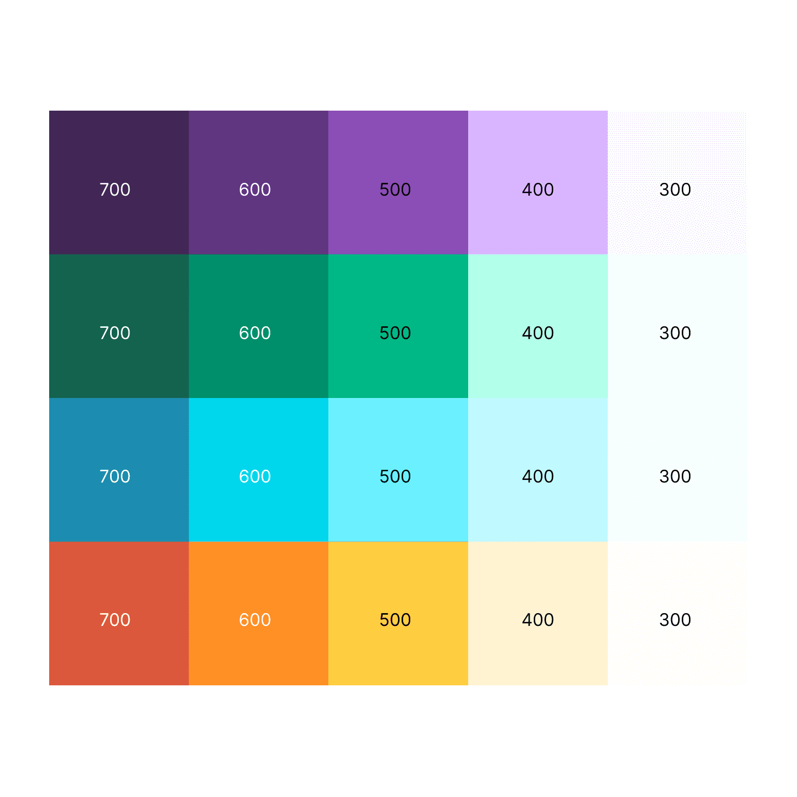
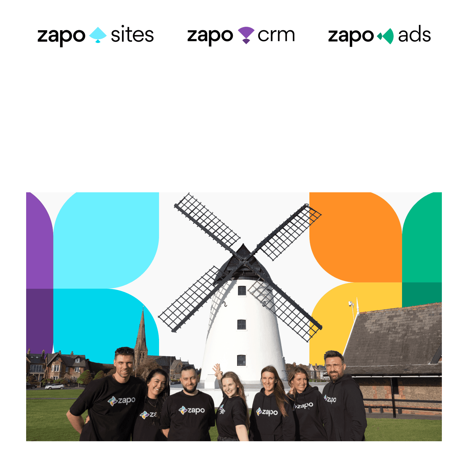
First: a refreshed brand
Together with Brand Designer we chose four main colors for the brand, each one linked to a different part of the product, like CRM, Ads, or Sites. But the identity needed more than just color, it needed a story.
First: a refreshed brand
Together with Brand Designer we chose four main colors for the brand, each one linked to a different part of the product, like CRM, Ads, or Sites. But the identity needed more than just color, it needed a story.
First: a refreshed brand
Together with Brand Designer we chose four main colors for the brand, each one linked to a different part of the product, like CRM, Ads, or Sites. But the identity needed more than just color, it needed a story.
Zapo is inspired by the town of Lytham, where an old windmill once helped the local community work more efficiently. So, we created a visual symbol made of small blocks and leaves that, when combined, look like a windmill. It’s a quiet reference to Zapo’s goal: helping local businesses grow and stay productive, just like that windmill once did.
Zapo is inspired by the town of Lytham, where an old windmill once helped the local community work more efficiently. So, we created a visual symbol made of small blocks and leaves that, when combined, look like a windmill. It’s a quiet reference to Zapo’s goal: helping local businesses grow and stay productive, just like that windmill once did.
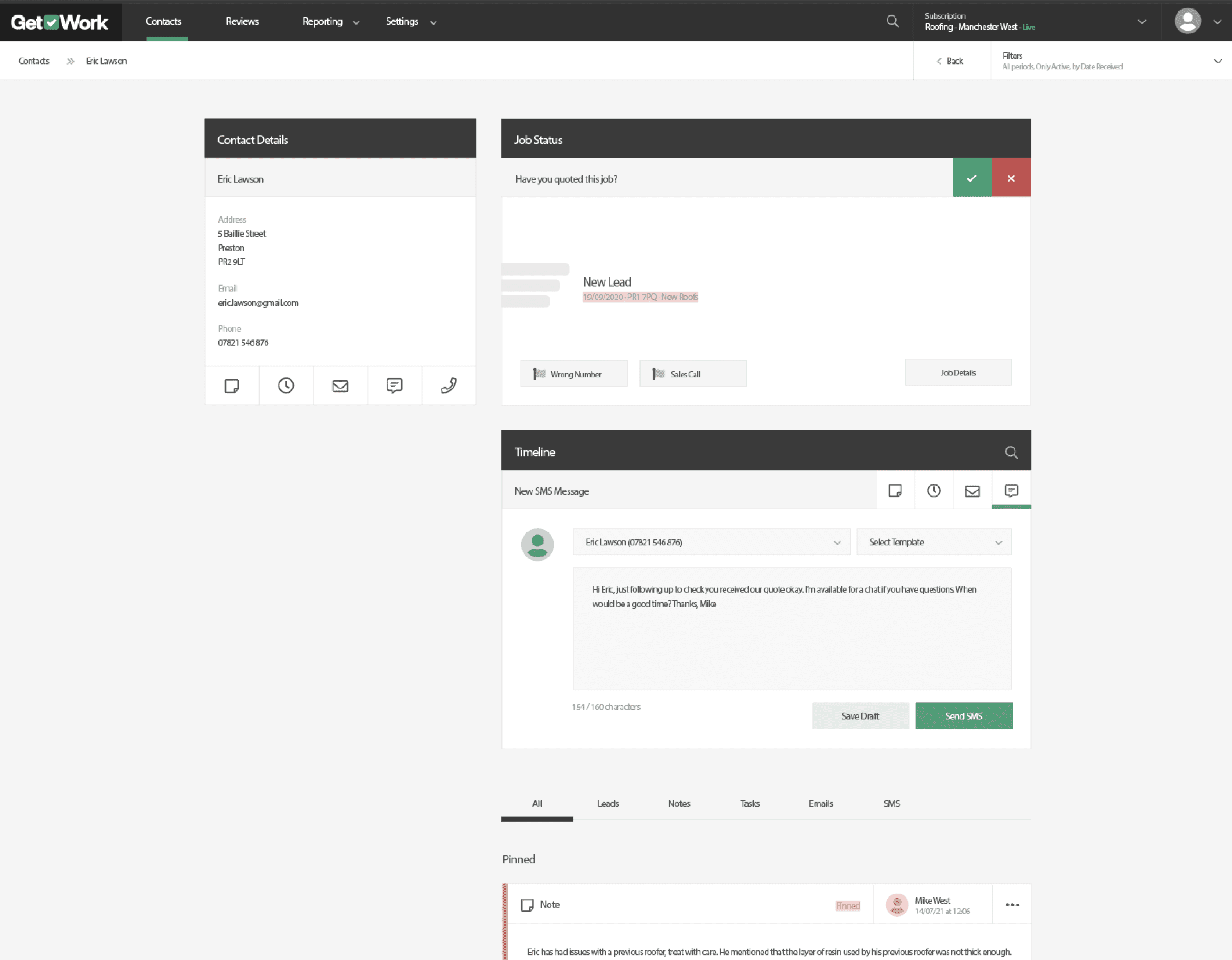
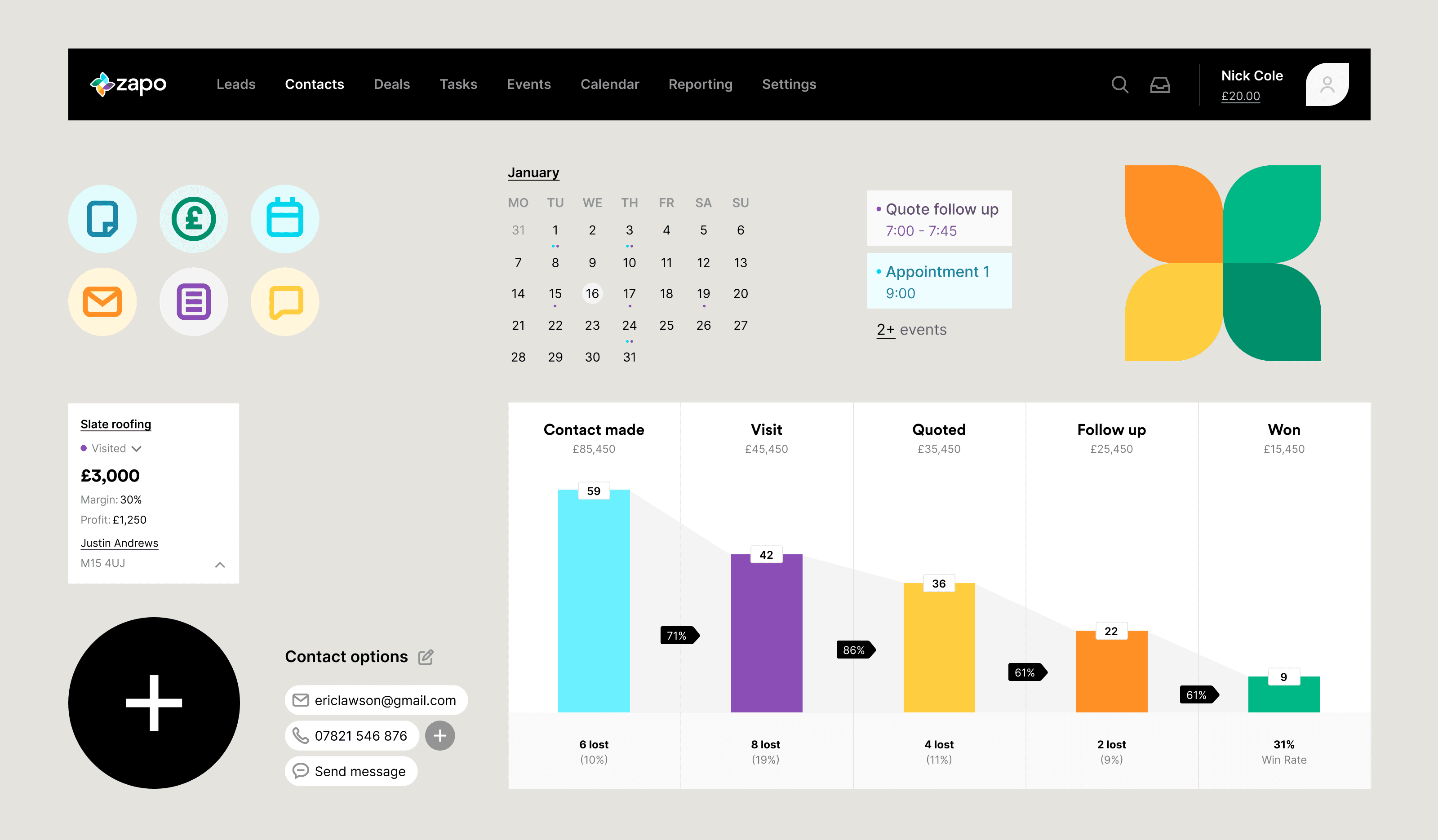
Second: a better product experience
Together with Zapo team, I redesigned the interface to feel more focused and easier to use.
Second: a better product experience
Together with Zapo team, I redesigned the interface to feel more focused and easier to use.
Second: a better product experience
Together with Zapo team, I redesigned the interface to feel more focused and easier to use.
Some of the key changes included:
Some of the key changes included:
A layout built around three clear sections:
A layout built around three clear sections:
Info about the contact → Timeline activity → Quick actions user can take
Info about the contact → Timeline activity → Quick actions user can take
A simplified navigation that brings core pages: Contacts, Leads, Deals, Tasks, Events, Calendar
A simplified navigation that brings core pages: Contacts, Leads, Deals, Tasks, Events, Calendar
A prominent “+” button to quickly create Emails, SMS, tasks, events, notes, or deals
A prominent “+” button to quickly create Emails, SMS, tasks, events, notes, or deals
More flexible filters so users can control what they see: by timeframe, type of activity, or person
More flexible filters so users can control what they see: by timeframe, type of activity, or person
Improving through iteration
Improving through iteration
Improving through iteration
Since I was working externally, Zapo’s team took care of testing. After each prototype, they ran sessions with some users and asked them to complete the same set of tasks:
Since I was working externally, Zapo’s team took care of testing. After each prototype, they ran sessions with some users and asked them to complete the same set of tasks:
Check if a lead responded and send a follow-up email
Check if a lead responded and send a follow-up email
From the Contacts page, find Eric Lawson and add a new task
From the Contacts page, find Eric Lawson and add a new task
Update a deal status
Update a deal status
Find the most recent email to the client from a teammate
Find the most recent email to the client from a teammate
These tasks reflected what users actually do day-to-day. Here’s how the design evolved across three focused rounds of iteration:
These tasks reflected what users actually do day-to-day. Here’s how the design evolved across three focused rounds of iteration:
1st iteration
This version helped us spot what was missing. What we learned:
This version helped us spot what was missing. What we learned:
No filters, so the timeline was long and hard to scan
No filters, so the timeline was long and hard to scan
Every message and email was shown in full, which made it difficult to find specific activity (like a teammate’s email)
Every message and email was shown in full, which made it difficult to find specific activity (like a teammate’s email)
The deal section asked “Quote sent? Yes/No,” but if users made a mistake, they couldn’t undo it. There was no way to manage status from here
The deal section asked “Quote sent? Yes/No,” but if users made a mistake, they couldn’t undo it. There was no way to manage status from here
Adding a new task worked, but users asked: “What if I need to edit or track multiple tasks, do I have to leave this page?”
Adding a new task worked, but users asked: “What if I need to edit or track multiple tasks, do I have to leave this page?”
What users said:
What users said:
“I didn’t expect that clicking ‘Yes’ would hide everything.”
“I didn’t expect that clicking ‘Yes’ would hide everything.”
What users said:
What users said:
“It’s hard to spot my teammate’s email, they all look the same.”
“It’s hard to spot my teammate’s email, they all look the same.”
What users said:
What users said:
“I added a task, but now what? Can I change it from here?”
“I added a task, but now what? Can I change it from here?”
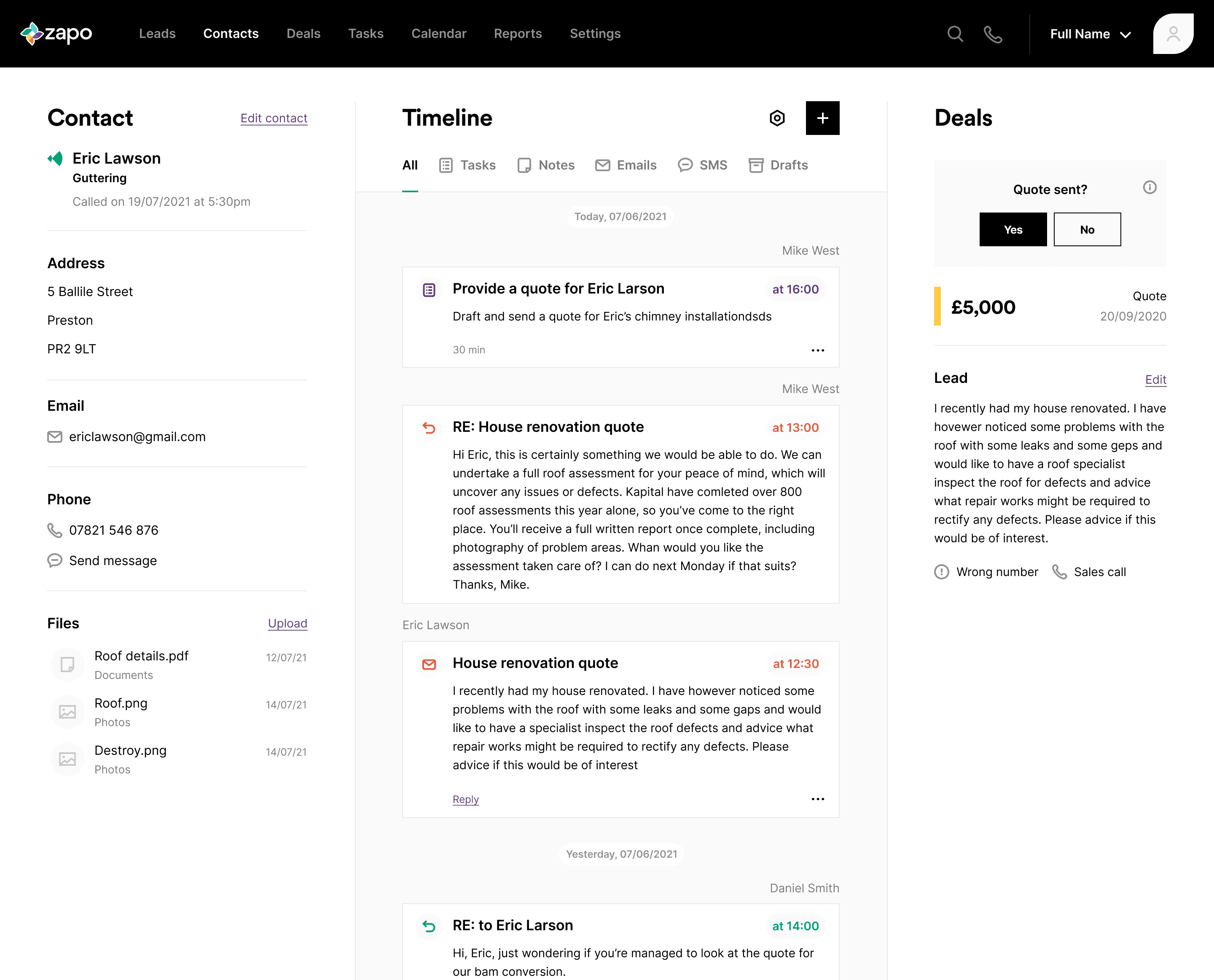
Iteration 2: Making key actions more visible
Iteration 2: Making key actions more visible
Iteration 2: Making key actions more visible
What I changed:
What I changed:
Added filters for specific types of activity
Added filters for specific types of activity
Made names on timeline more prominent, with clickable links to see who they are
Made names on timeline more prominent, with clickable links to see who they are
Replaced the “Quote sent?” block with Recent Deals, showing deal history with pop-up previews
Replaced the “Quote sent?” block with Recent Deals, showing deal history with pop-up previews
Added Recent Tasks & Events
Added Recent Tasks & Events
Users could now see multiple deals, check their status, and preview info without switching pages
Users could now see multiple deals, check their status, and preview info without switching pages
These tasks reflected what users actually do day-to-day. Here’s how the design evolved across three focused rounds of iteration:
These tasks reflected what users actually do day-to-day. Here’s how the design evolved across three focused rounds of iteration:

2nd iteration
What we learned:
What we learned:
Users could complete the follow-up and task creation easily
Users could complete the follow-up and task creation easily
They successfully found the teammate message using filters
They successfully found the teammate message using filters
The deal status interaction still wasn’t obvious, users didn’t realize the deal was clickable
The deal status interaction still wasn’t obvious, users didn’t realize the deal was clickable
What users said:
What users said:
“This is better, I can filter by email now.”
“This is better, I can filter by email now.”
What users said:
What users said:
“I like more prominent names. Looks good!”
“I like more prominent names. Looks good!”
What users said:
What users said:
“I didn’t realize I could click on the deal, I thought it was just a label.”
“I didn’t realize I could click on the deal, I thought it was just a label.”
Iteration 3: This version focused on actionability
Iteration 3: This version focused on actionability
Iteration 3: This version focused on actionability
What we changed:
What we changed:
Introduced smaller activity rows (accordion-style) in the timeline to reduce scrolling.
Introduced smaller activity rows (accordion-style) in the timeline to reduce scrolling.
Underlined task/deal/event headings for better visibility and added arrow icons linking to the full list
Underlined task/deal/event headings for better visibility and added arrow icons linking to the full list
Introduced breadcrumbs at the top of the page
Introduced breadcrumbs at the top of the page

3rd iteration
What users said:
What users said:
“I found the teammate message faster this time, those summary rows really help.”
“I found the teammate message faster this time, those summary rows really help.”
What users said:
What users said:
“I can change my task status right here, great.”
“I can change my task status right here, great.”
What users said:
What users said:
“This feels organized, and I don’t need to click around as much.”
“This feels organized, and I don’t need to click around as much.”


Before / After
Some of the other key screens:
Some of the other key screens:
Some of the other key screens:
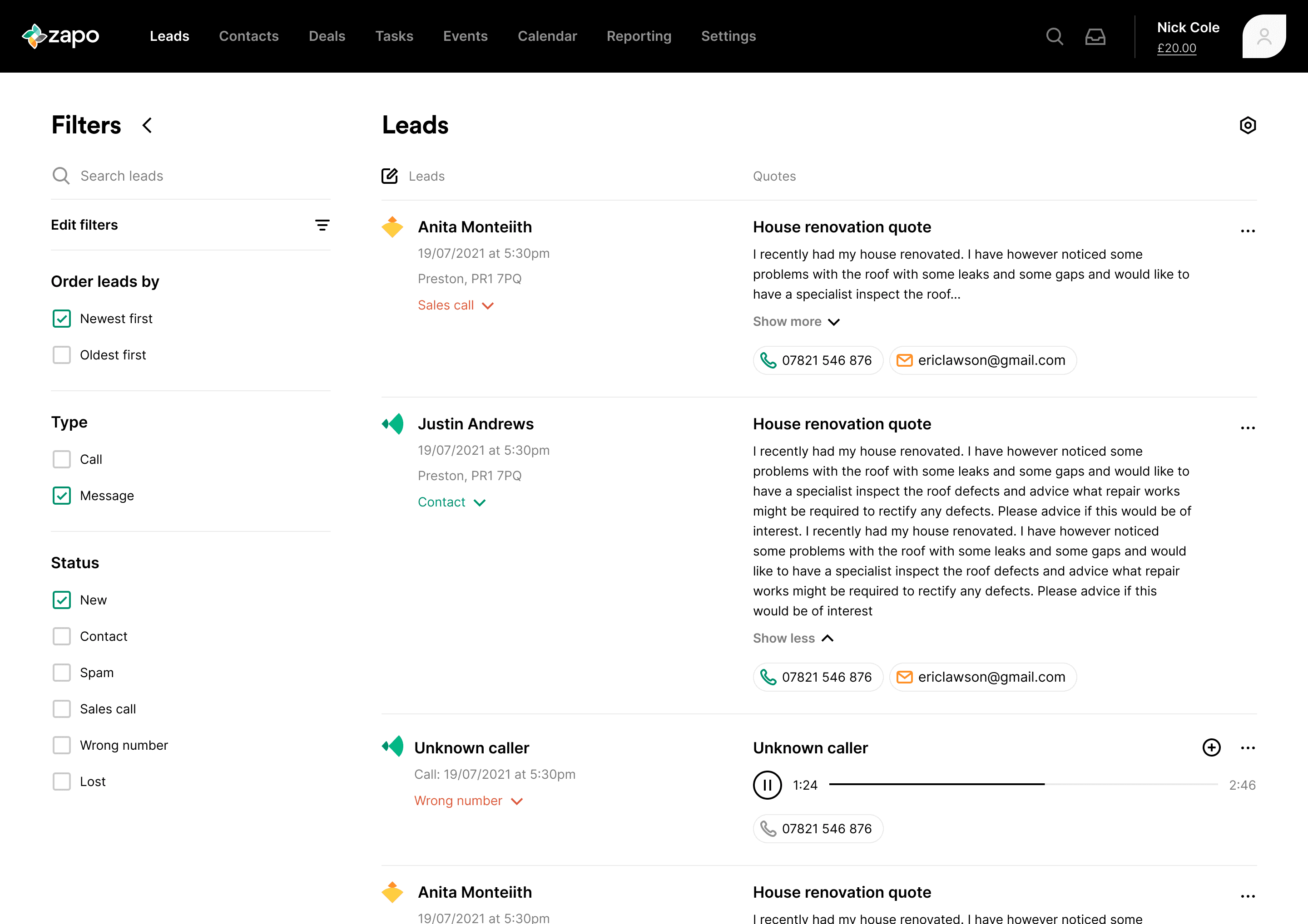
Leads page
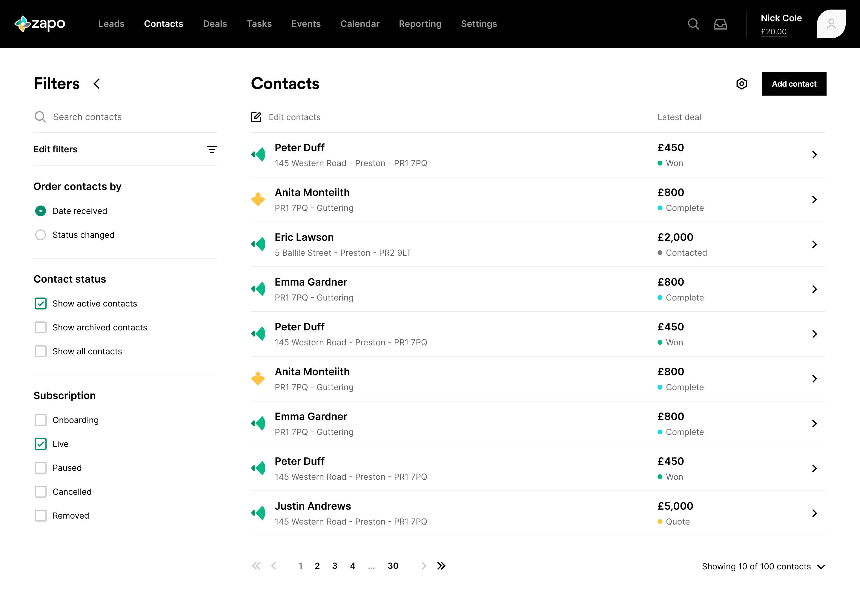
Contacts page

Deals page
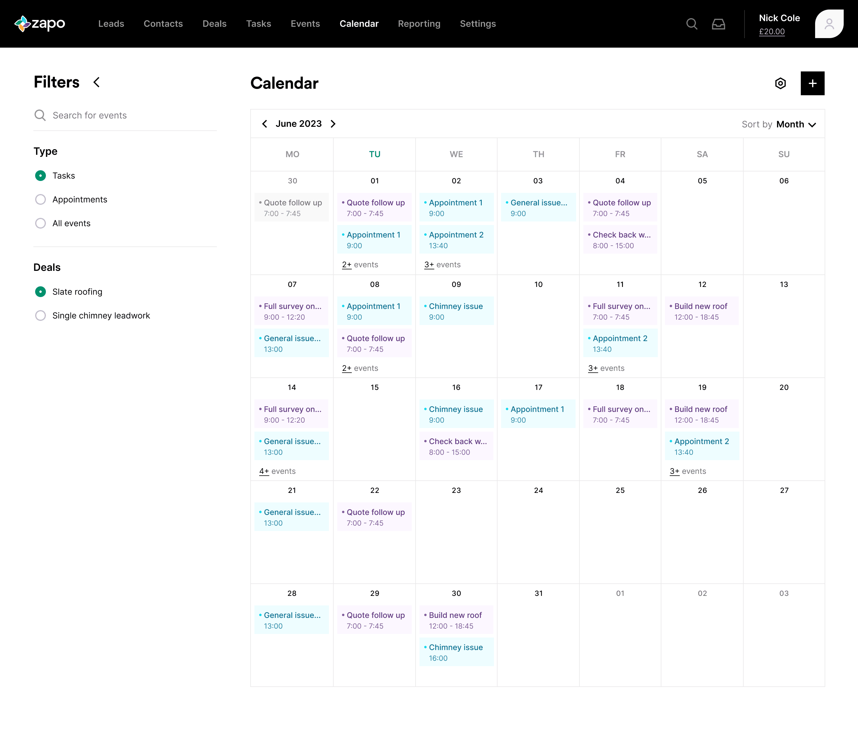
Calendar page
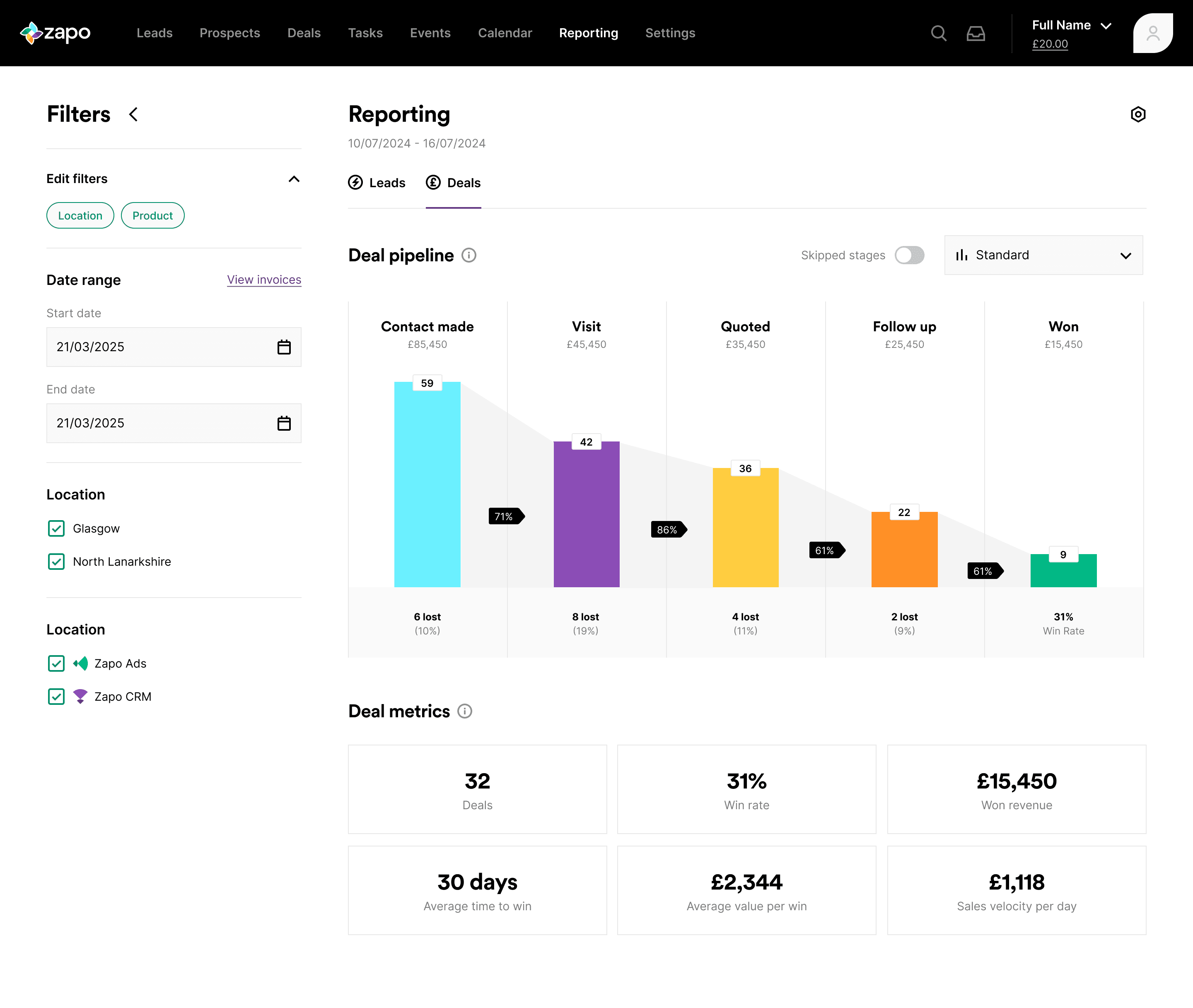
Reporting page
Where we ended up
Where we ended up
By the end, Zapo had:
By the end, Zapo had:
By the end, Zapo had:
A fresh brand identity with a modular, scalable visual system, used across the product, website, and marketing
A cleaner, more focused CRM experience, including a redesigned Contacts Timeline that makes day-to-day lead management easier
A user experience shaped around clarity, speed, and real business workflows